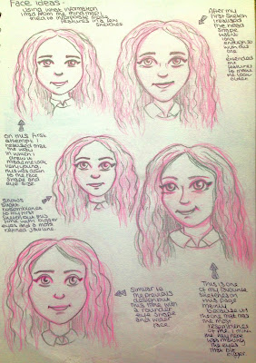
 This is my first page of my drawing which i did while in class. I find it quite hard to do work when in front of people i find it easier to sit at home and not share my work with anyone, this is probably just because of my personality.
 For the first sketches i used a Prismacolor Col-erase pink pencil just so i could get the base lines down before i committed with a stronger colour when it would be harder to rub it out. I really like using these pencils because it lets you create a soft line for all the guideline marks on the face and you can either rub them out of just leave them.
So after i did these i got a good idea of what style i wanted to go for and in this case its just my normal drawing style. I also knew from this which parts i wanted to exaggerate. So personally i think my hair is probably my most noticeable feature which is why in my character the hair will be quite exaggerated.
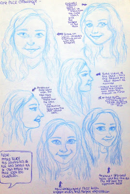
Once i had done these drawings in class, like i said, i went home and did another page with a few changes in the angles i used which also better reflected my features because its my normal 'Selfie' angle so to me it felt more recognisable.
 Here is the page i was just talking about. As you can see the drawings look slightly more realistic than the ones in the previous image which is probably why i prefer this page.
 Once again i used my Col-erase but this time i used a blue. Sometimes i decide that i don't want to go over the lines so i just keep it as it is. This does prove more difficult when posting on here because the lines aren't as strong but in my sketch book i think this really works.
I'm not sure if you can read them on here but i always write notes around my drawings (force of habit from college) but its actually really helpful for me and who ever looks through my work, just to see what i think of a drawing. Even though it might be hard its always good to pick up on things that you did wrong just so it helps you improve. For example in these ones i told myself to 'make sure the forehead is not too small and the face is longer' which heps the character look older.
So now that i had done these pages it would be easier for me to get an idea of my characters facial features and how i wanted her to look.
Side note: I'm sorry for the quality of photographs on this page. I tried to edit them in Photoshop to get rid of the tint but it i couldn't get the contrast right.

